Leaderboard
Popular Content
Showing content with the highest reputation on 07/23/2020 in all areas
-
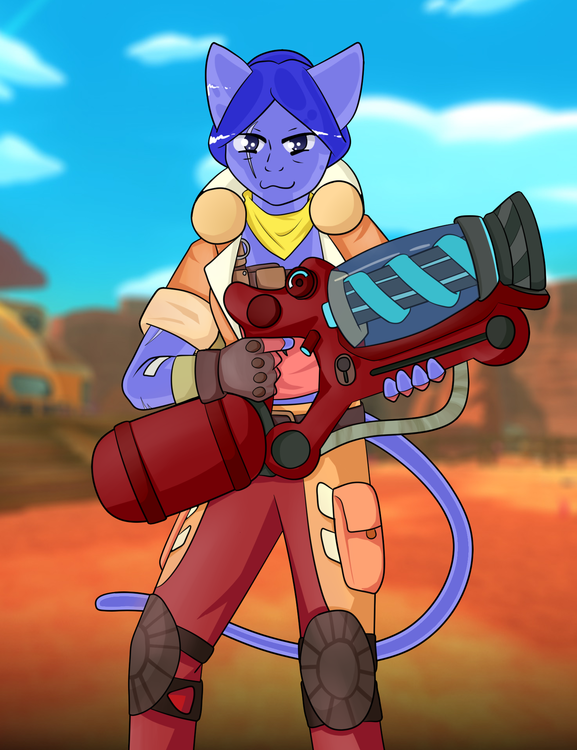
Miraculous AU stuff A silly doodle of my DnD character Auriel and the party. Where it's I guess became a thing that Auriel becomes attracted to people going against the party. I let other people make a DnD character for me. She's a nice lady... I let other people make a Witch for me... Make up a Wanted poster for my Tiefling character. I did up some concept art for a Grasshopper like species!! Auriel and Arui wrestling Drawings of a young Auriel. A redraw! 2020 vs 2016. It was a very slow shift in medbay, so they're just chilling infront of the operating rooms. (This would have based off of the old medical layout)2 points
-
2 points
-
Love your linework and your colouring style!! Your art is really nice to look at!1 point
-
1 point
-
In little more than five minutes, a light that had been faded away days ago suddenly shone again. Not just this light, but everything too. The power had been restored! Who were these figures, and why had they saved them? Suddenly, a message over the radio. "What, you didn't think we were gonna let the station die without a survivor to warn Nanotrasen about the guys who killed it?" And then, the ship vanished.1 point
-
3 days later, though the ship has long since been reduced to running only the most basic of functions, the travelers yet cling to life. Their beacon had died long ago, yet they hold out hope someone was listening at the exact right time. All of a sudden, a bright light appears. A ship? Out here? Traversing this exact part of space by sheer chance? Impossible, it must be rescue. The travellers hold out hope as the light approaches their pod, hoping that it is their salvation.1 point
-
2 Distant travelers, in a small space pod, drifting. The battery cell is so low now, and they have only got one space suit. They didn't expect to get lost so easily, but the dark expanse of space encapsulates and surrounds. Their only solace being the ruined stations of progress long crumbled and defeated. The stars shine just as beautifully as if they were back home on station, as if to taunt them. The hunger only accentuated by the dread, causing a pit in their stomachs that continued to hound as they tried to concentrate on the Nav-computor, before it goes dark and becomes a useless black tablet- a blank tablet, fitting for the tomb that they might soon find themselves in.1 point
-
It is finally my turn to do this. 0 mhelps resolved1 point
-
Alright, back again with some more practice under the belt. First is a miner. Tried a different style for this, feels easier and is kind of cute. This next one is a RIG/hardsuit helmet. I really love the design, and tried to do some shading and perspective tricks with it. I really don't know where to go from here. Send help and advice, please.1 point
-
1 point
-
The primary issue I'm trying to solve here is congestion: the main supply office is also the entrance to the cargo bay, disposals, the ORM, and the mailing room. This means that at any given time: a miner could be dragging an ore box to the ORM, someone could be walking back and forth between the lathe and the front desk to handle requests, crates are being dragged out of cargo to give to crew in the lobby, crates are being brought in from the lobby, either empty or with things that people are shipping, crates are being pulled from the cargo bay to disposals to mail, and MULEbots are moving in and out of the department. In situations that require cargo to distribute things such as weapons to the crew, they either have to hold all the internal airlocks open, or bash open the grates, or just have people climb through the front desk window. So the reason why things in my design are moved about so drastically is to group related job components together. The MULEbot and mail room are next to each other, and close to the cargo bay, *and* have a dedicated maintenance flap so MULEbots don't try and get through the lobby. The ORM and the mining dock are right next to each other, so that they don't have to crisscross other crew in the supply office. There are other pet peeves I'm trying to address here. I think it's silly the QM's office is only accessible through mining. I think Cargo Techs need a dedicated break room. I like the look and feel of med and sci having one primary corridor that's more separate from the public areas. And so on.1 point
-
1 point
-
Bloofi is the most expert of science peoples. Here he is, developing a new type of machine. The purpose and reason behind this machine is top secret, so I can't tell you anything about it lest I incur his wrath. That said, he seems to be doing pretty well with it all. Science with sunglasses is often one of the best forms of science. They even count as safety goggles! And as we all know, being safe is the coolest thing you can do in a work environment. (He's totally qualified, trust me.)1 point
-
1 point
-
1 point
-
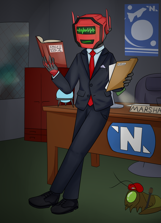
This was a commission done for @Esenno who's a wonderful trial of a nerd. It's law. MARSHAL law. Here they are doing some reading on a particularly difficult case. Probably the murder of 4 grey-shirts who broke into the kitchen via the chef who made them into delicious burgers. Trespassing in the kitchen will do that. or maybe not. He's probably looking at something a lot more serious. At least he's got some company to keep him motivated. *chirp1 point
-
I am not familiar with the codebase, but I am wondering if it is possible to update the interface from the exosuit fabricator. Currently when you click on the exosuit fabricator, the first page you see is the materials that are in the fabricator and the category of items (cyborg, medical, other etc.). However, when you click on one of the category (for example, "cyborg"), it brings up a list of cyborg components that can be built and the materials required to build them. However, this page is now missing the materials that are currently in the fabricator. Similarly, if you are in the batch printing screen and do not have enough materials (printing multiple items at once), it will only tell you that you do not have enough resources. Suggestion - a) When you are selecting the items being built, where it also shows you the material it required, change the text such that materials that are missing or not enough are shown in red. This will be similar to the protolathe when you are trying to build item that you do not have enough material of b) When batch printing items in the exosuit fabricator, make it such that it will list the total materials needed and materials that are missing/not enough will be shown in red.1 point
