
Leaderboard


Popular Content
Showing content with the highest reputation on 06/13/2022 in all areas
-
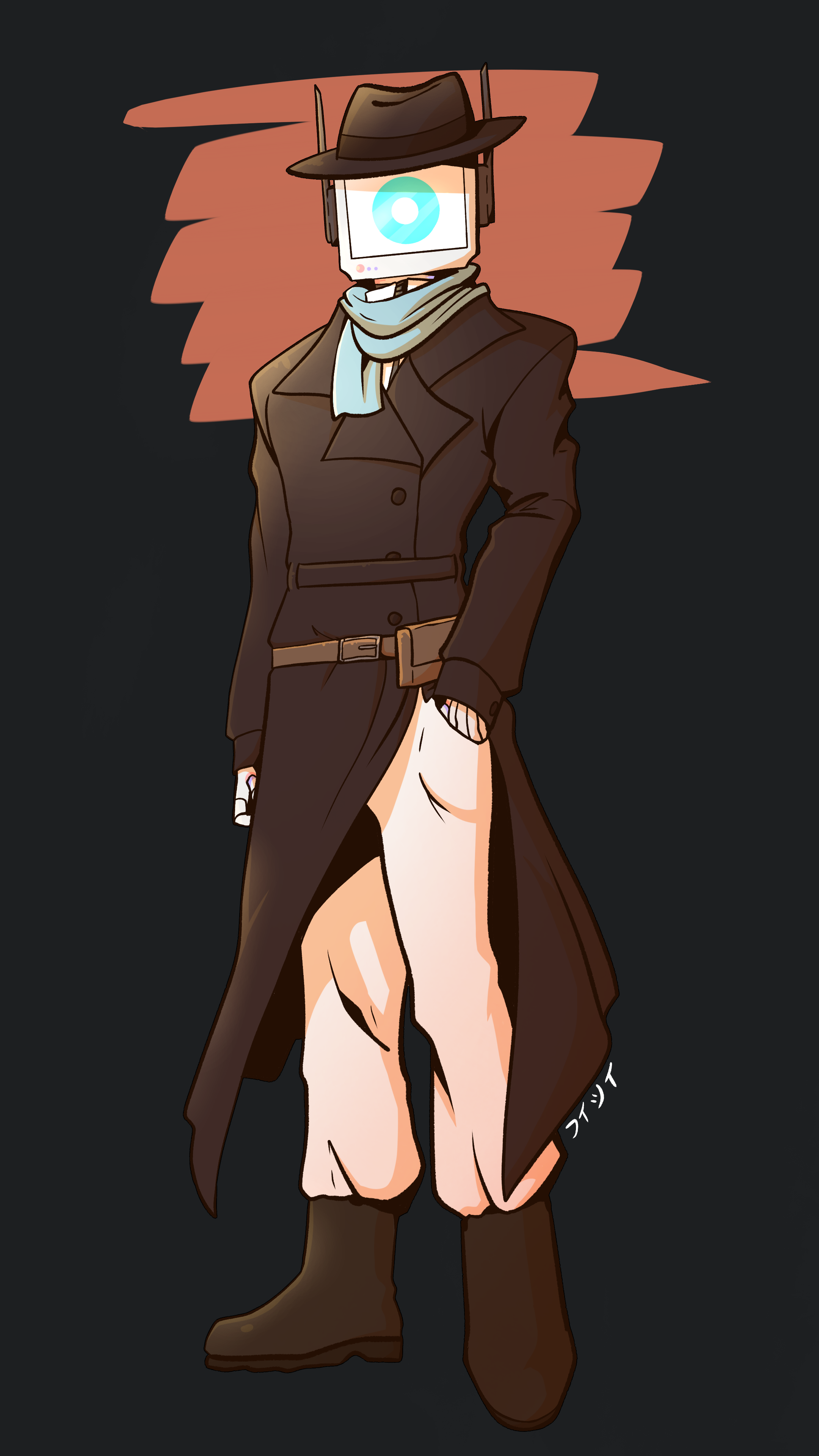
First Name: PLATINUM Last Name: N/A Gender: Male Orientation: N/A Nicknames/Alias: PLATINUM, Platinum, Plat Age/D.O.B: 35 Years Old Place Of Birth: Boron Station Beta (Orbital Research Facility) Species: Integrated Positronic Brain (IPC) Blood Type: N/A Alignment: True Neutral Affiliation: Nanotracen Religious Beliefs: N/A History/Personality Character Biography Personal Relations Faction Relations Other Information I'm not totally sure if I've filled this all out correctly, but it was a blast spilling my brain out on PLATINUM's character. I may change and revise things later on if I get the feel that I want to. Art credit to フィシィ, great person all around
 2 points
 -
I'm not too big a fan for a couple reasons: As others said, I feel like it's a bit TOO much darker, doesn't go very well with our walls, and makes things look flatter color-wise. But personally I really don't like the texture. Feels less like "Tiles" and more like Rubber padding to me. Which i'll admit i'd like to have as an optional craftable/paintable floor tile for decoration sake, but not as a station-wide replacement. EDIT: Also I really think the Plating tiles in maintenance look significantly worse than what we have now.2 points
-
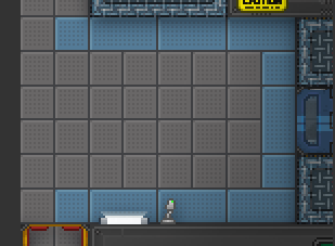
Partially mirroring my late GitHub comment: not a fan; the whole station turns like 40% darker as well as more dull, since the new floors seem to trade natural gentle discoloring and color smudging for flat coloring and a group of dots on each quadrant. With the darker tiles, places like Medbay/Science become gray rather than white, and the half-white-half-colored tiles lose a lot of vibrancy and contrast. The change also messes with the general floor-wall contrast difference, not sure if in a good direction. One place that does look a bit better is the kitchen, with the black-white tiles becoming a bit less straining to look at, though that's about it. The maintenance plating has the opposite problem, being very smooth and shiny - almost cleaner than regular floors - which is odd for what's supposed to be a comparatively seldom-used, run-down maintenance tunnel with dirt and cobwebs galore. I'd also agree that having the dotted floors everywhere is a bit much visually, imo the new dotted variant should indeed be a separate tileset and be used somewhat sparingly; the dots also give the floors a slight "high-traction" feel they aren't supposed to have (as that's a separate unique tile type with actual gameplay effects).2 points
-
Yahi is lovely and I adore her2 points
-
Given Name: 993 Family Name: ARMA Gender: No Orientation: Yes Nicknames/Alias: Arma, 993, Three [by other ARMA-99x units] picture: a narrow pink robot in a longcoat over a skirt. their monitor has a heart with a snowflake. (artist is Bleats, FA: goat-kid) Details Detailed Information Character Biography Family Personal Relationships Admire / Crush | Friend | Acquaintance | Dislike Faction Relations Allied | Love | Like | Secret | Neutral | Enemy1 point
-
A lot of this has been said before, but they just seem too dark, and the speckled pattern in each corner of the tile seems off. Reminds me of foam flooring / having no slip mats / rubber boot mats on every tile. Just seems off / distracting.1 point
-
It's very mixed for me. On one hand, I like them. It's a nice refreshing look. On the other hand, the dots throw me off. It's too much noise for the floor and gives it a more industrial look rather than a fancy research space station. Alongside that, the white is very dulled out right now. It gives medbay and even research very sharp contrasts with the rest of their brighter equipment. The abundance of the 'dots' make them look like ceiling tiles rather than floor tiles. This doesn't mean the dots are BAD, but perhaps we could explore the option to have both an undotted style and a dotted style. It would also double the floor painting option for everyone. BONUS: I do like the new freezer floor.1 point
-
They have too much relieve and detail, causing the visuals to feel overloaded. Meanwhile, there are many items that don't have that depth and makes them look out of place. Also tiles give an industrial feeling to me, maybe its the many dark dots they have, like if it was a metal plate. The darker tone looks cool, though. Still weird at least in the hallways, since everything seems to be way brighter.1 point
-
For those who voted no, is your opinion likely to change if these tiles get split back into quadrants instead of triplets React with a toolbox emote on this post if so.
 1 point
 -
I like the new beveling, but overall the beveling and the dots make the floors distracting somewhat. I personally liked the lighter floors because they stood out from the walls, better highlighting the area where the game is played. Also heavily agreeing with medical/science being not white is weird and maintenance being way too clean1 point
-
I laughed harder than I should've
 1 point


.thumb.png.babd1ad528f8fa9594bb2c14163d92ea.png)