Leaderboard
Popular Content
Showing content with the highest reputation on 09/16/2022 in all areas
-
Changing the config option "non_repeating_maps" from false to true will prevent players from voting on the currently played map during the map vote. Paradise has an unhealthy attachment to Box which stems it being the only playable map for the vast majority of this communities life. Our other maps will never updated, made better, or otherwise fixed if no one ever plays them. And when someone does try to fix one of our maps that isn't Box it can be highly demoralizing when those countless hours spent mapping are essentially wasted as it goes completely unused. For me at least I think the most frustrating part is that our other maps Delta and Meta aren't even bad or broken, it's just everyone is stuck in their ways with Box and refuse to vote for anything else. To be honest, this is going to force peoples hands a bit, and there will probably be people complain about having to play other maps, but we've been playing Box for the past nine years, so I think it's about time we give other maps a shot. This monotonous cycle of Box Box Box Box Box needs to be broken and this is one very easy way to do it, it's as simple as changing a config option from false to true.3 points
-
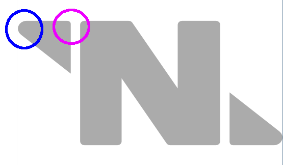
I don't know where to put this anymore, because it's sort of art, sort of design, sort of UI, and sort of lore, so I'm just putting it here. Here's the NT logo on the wiki. I've highlighted the three inconsistent, blocky corner types: And here's the NT logo as rendered in TGUI, with different angular corner types. I think in the TGUI the differences are intentional, but generally the triangles are represented as right isosceles triangles, and the much larger curve radius in blue obscures that. In addition, the corners of the "N" are also rounded, so it's confusing as to whether it's a stylistic choice or a faithful representation of the logo. It would be cool if these were consistent, and the logo itself should be properly proportioned and balanced; as you can see in the wiki version, the triangles aren't aligned vertically with the "N". The aspect ratios between the two are also vastly different; the core elements of the logo on the wiki have an aspect ratio of 2.05:1, but the TGUI's logo has an aspect ratio of 2.125:1. The Syndicate logo on the wiki is much better off, but could still do with some touch-ups; it has a slight shading on the elements and the border radius of the S is off in places: And the Syndicate logo in TGUI is completely different: I created new vector logos for NT and Syndicate; they are both the same aspect ratio and built on a similar grid. The NT logo has no curved edges in this case, which I think fits NT better, whereas the Syndicate S has large border radii to make it look slightly more snake-like. The aspect ratio is the one used for the logos on the wiki currently, which is ~1.62:1, which is within a hair of 8:5, which is a not uncommon ratio in real-life flag design. The new versions: The vector downloads: WSO_SS13_SVG_CorpLogos.zip Dunno if anyone else cares about this kind of consistency but thought I'd share it all here before I forget about it entirely. You're also free to use these for whatever, they're licensed as CC BY-SA 3.0, since they were built off of the existing logos on the wiki, which are similarly licensed.3 points
-
Also known as Shaw. Hello fellow nerds! I have come to the realization that I am nearing my 4 year anniversary of playing on this delightful spessman game and currently boasting 2200+ hours on Paradise alone; and I never did do one of these introductions! Better late than never, eh? Some of you may know my character in game, Dahk Grel the vulp. He’s one of my first characters and definitely my most played. He’s a bit of a self insert at times as opposed to some of my other characters who I’ve actually invested lore and character traits into, but I still love to play him for that slightly more casual feel. Paradise has been my most favorite game/server to play over the last nearly four years, and I hope to invest another four at least. The community, game mechanics, art style, inside jokes, and atmosphere are the absolute best I’ve ever seen in a game, and for that I love it to death. I have also absolutely been ‘that guy’ who tries to get IRL friends to check out ‘that weird 2d spess game that’s definitely not Among Us+‘. Here’s to another four years, nerds. Love ya. <32 points
-
While we're on the toping of voting in the more recent replies, How about changing it so that the map voting phase begins when the shuttle launches? Personally, I forget to map vote at the end of the round because I'm too busy running for my life or murdering others due to EORG. While doing this might break the immersion of the game a little, I feel like it's a decent sacrifice to make in order to get more map votes. This is because in that phase of the shuttle, most people are just sitting down and waiting for the round to inevitably end in the next 3 minutes. The map voting phase can begin for those not doing anything and get their early votes in. When it comes to things like hijack where the traitor is killing all of the passengers to gain that sweet greentext, everyone involved can just wait until the bzzt bzzt bzzt sound when the round officially ends to place their vote since they still have a solid minute or two to place their vote.2 points
-
If you want the choice of the players to be respected I suggest running a community wide vote on whether to enable this config option or not. I don't think it'd be too hard to add a forum thread with a poll in the MOTD. Or at the very get the staff team to vote on this. A community vote would show what everyone wants, not just what 10% of a server voted for in 60 seconds.2 points
-
2 points
-
The idea of changing things so that even if 99% of people want a map, it is only selected 50% of the time at most seems incredibly unfair to me. If enough people vote for another map, then that map will be picked.2 points
-
Heck I would say have the vote take place at round start while everyone is waiting there at the lobby. They have nothing better to do than wait for the round to start, maybe more might do it while they are waiting.1 point
-
If there really is a high demand for non-box maps, then encouraging people to vote more seems to be the best option. Not removing people's ability to vote for their preferred option. Forced pop-ups, sounds, a bigger icon, all that seem to give the players on the server the best and fairest choice. Removing the option to vote for a map entirely comes across as grossly unfair and the 'sour grapes' option.1 point
-
This is what should be used on the wiki tbh. I'm guessing the inconsistency between all the logos is because there's absolutely no standards in place for them.1 point
-
>Be traitor with HoS gun objective >Buy surplus crate solo for the meme >It contains a trick revolver >Break into EVA for a space raid into HoS office >Steal the mime’s space suit as it was only one left >The mime just so happens to see me >I flee into maints >Mime gives chase >Flee out airlock >Mime still chases >Stare at mime as they try to punch me to death while they take space+oxy damage >Casually drop the trick revolver >They grab it >Click >Honk.1 point
-
I would like to see it enabled so it will force people to learn other maps. The main reason I hear about meta and delta not being voted is that people don't want to play them because they don't know those maps - so they just vote Box over and over again because they already took the time to learn it. Due to these low effort people, other players like me who are incredibly bored of Box, are stuck with the Cyberiad. Meta and Delta are not perfect, but Box wasn't like this before either. It needed thousands of playhours to evolve to this point. Other maps deserve this chance too, I think. Box will be voted every second time anyhow, so it wouldn't "kill it" or other hyperboles I keep hearing on OOC whenever this is brought up. They can still spam it, but we get to enjoy other maps as well.1 point







.thumb.png.babd1ad528f8fa9594bb2c14163d92ea.png)
