
Leaderboard


Popular Content
Showing content with the highest reputation on 04/23/2023 in all areas
-
I don't like having an advantage over people because of what kind of monitor I have. Either I see more than my opponent, or I have a more readable chatbox than my opponent. A little extra screen space isn't worth the balance implications.2 points
-
I, as a non-combat role player, don't really see many issues Sure, a visual bug here and there but that's about it. Chat, usually, isn't THAT terrible either. In fact, I barely notice something has changed. It took me fifteen minutes today to even realize my screen got bugged by a mech. But at the same time... I just don't really get what seeing four more columns gives you. I just don't see a point. I also often hear about two issues players present: 1) they don't have a screen that'd support a widescreen 2) they get motion sickness from playing the game on wider screen (I'm not an expert with diseases, I am just mirroring what I heard) Then also come people who just lack that chat space or simply don't like the larger screen I believe a good chunk of playerbase would refuse to play with widescreen, and as rurik said, adding a toggle sounds kinda pointless. Either fully commit to it, or don't at all.1 point
-
This thread is going to make me start profiling for the average length of a chat message to see how it looks.1 point
-
I would like to point out that every single radio chat message in your screencaps that isn't 2-3 words gets split into two lines. Considering common chatter more often than not is longer than that, you basically only got half the usual chat view compared to before. I'm aware chat highlights exist and all, but those are for specific phrases you definitely don't want to miss. People want to pay attention to the general comms conversations, too. While you could also argue that you can simply lower the chat font size, that's not really a solution either, only an inconvenience for those who prefer a larger font size to read stuff more easily. In general, being able to see a couple more columns of tiles on the sides - which I personally don't really see the usefulness of outside of maybe combat, and we're not strictly a combat-oriented server - does not seem like a good tradeoff for worse UX, on top of creating some other balance/design dilemmas.1 point
-
Another thing I heard from the Spriter-Man himself @McRamon was that any changes to screen size would require changes to things like cinematics, which play over the full screen - this means that if we did go for the "opt-in" wide-screen of 17x15 or 19x15, spriters would have to do thrice as much work to accommodate. It's less about lower resolution displays and more about aspect ratio. 1920x1080 and 1366x768 are both in 16:9 aspect ratio. This works well with the widescreen design. However, an aspect ratio of 16:10 has a slightly taller screen than a 16:9, and as such the window needs to stretch further to the side to accommodate this. With widescreen, this ends up with the chat box getting smooshed to the far right. For contrast with your images, this is how the widescreen TM appears on a 16:10 monitor: Not much space to work with, which is inconvenient for doing things like reading mentor tickets (I can only imagine the suffering admins will be having using a small window like this), and it also cuts off half the buttons in the top right. How am I supposed to see the beautiful Donate button like this
 1 point
 -
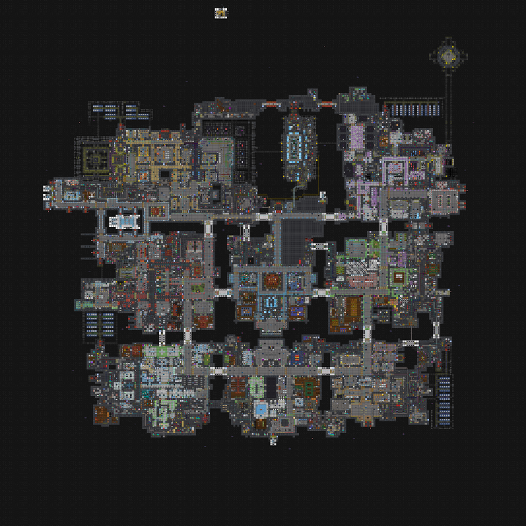
It is similar to Farragus in its layout (no association) but Shepard's main loop is roughly 348 tiles (97x77), and Farragus's is quite a bit larger: 484 tiles (133x109); meaning one loop on Shepard is about 140 tiles less (70% of Farragus's in length). In regards to the segmented maints, on Shepard there are some similar to Farragus, but the majority have multiple entrances and exits. Also unlike Farragus there are "deep maints" that run between modules (notably on the right, and upper sides of the station). In general Travel Times will still be longer than the box-like maps, but should be shorter than on Farragus, and the maints are a split between those found on the box-like and the ones on Farragus. I've added more direction signs than we had on the testmerge last summer, they'll be at every bridge and in the center of most departments. Still working on EVA in the blank area in the center of the station WIP :0)
 1 point