-
Posts
2,141 -
Joined
-
Last visited
-
Days Won
147
Everything posted by PhantasmicDream
-
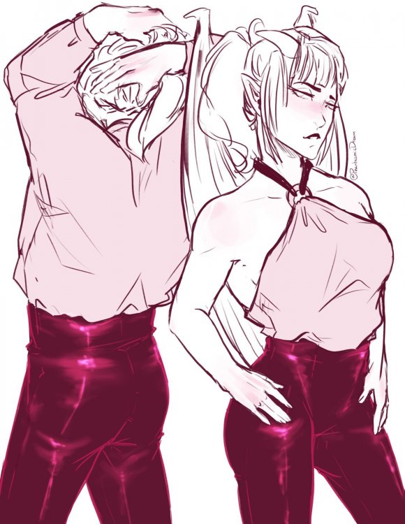
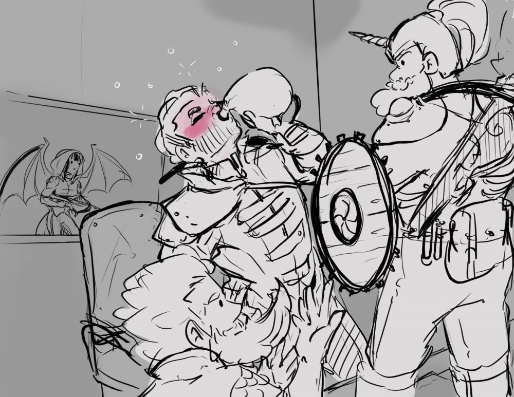
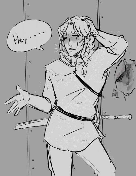
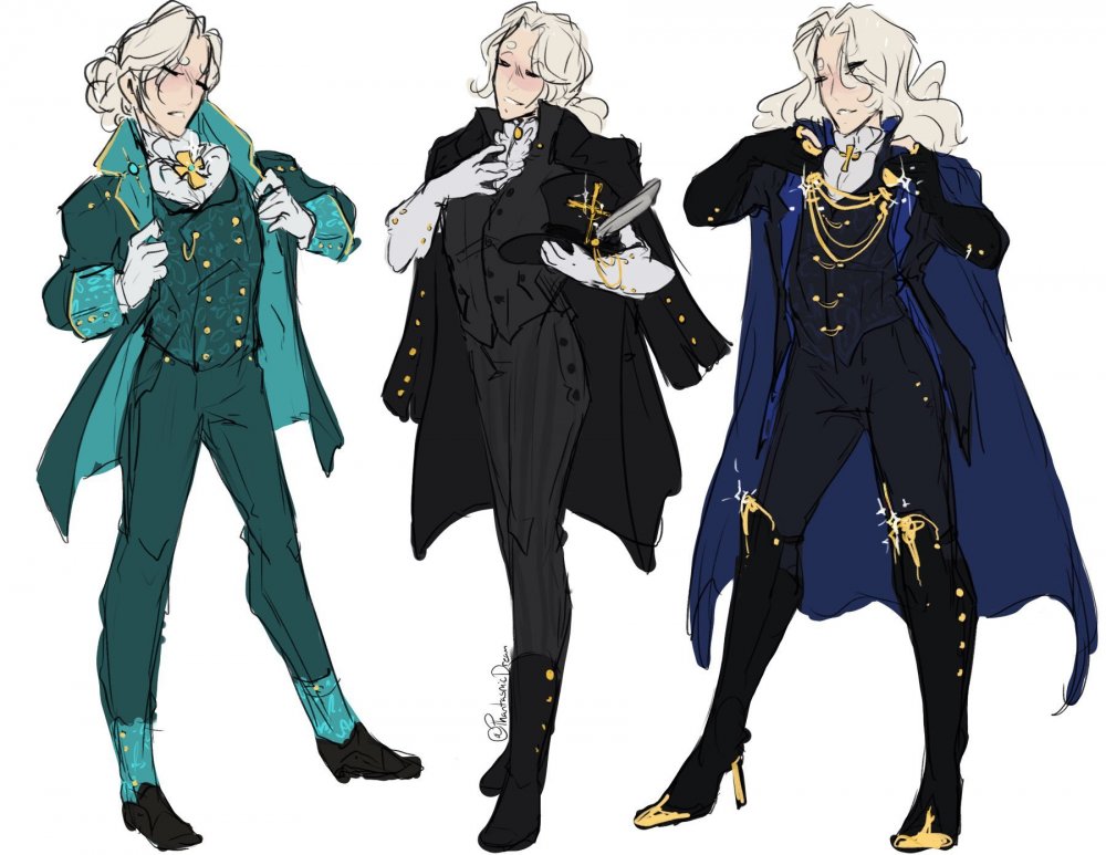
Sketches of Auriel blushing! During the last DnD session I was part of, the group went to a festival that a near by town was having. We started off with a drinking contest... Auriel and Holly were in and out of being black out drunk, while Darmorndin and Olrune were riding out the drunkenness fine (both winning the contest) Arui didn't take part in the contest. Poor Darmorndin having to carry Auriel's drunken ass. Later on in the festival, Olrune was taken into tent where they were telling stories. (Darmorndin, Holly, and Auriel tagged a long. Arui went to a sword fight) Olrune told a story about how sky dwarves came to be, involving angel hair being made into a lasso. During the story Holly mentions that Auriel is an angel, then started to wonder what would be the best way to "harvest" his hair. There was a wrestling match that people could take part in. Auriel being a bit too confident about joining in on the contest... ended up failing the match, hurting his ankle during the first match. After taking part in the festival, they all got rooms to stay in for the night. And I like to think this happened some point in the night...
-
After having a discussion with @necaladun about allowing Not Safe For Work (NSFW) themed art works to be posted on the forums. Months have gone by and he finally gave me the go ahead, mentioning that NSFW themed art could bring great awareness to the community. Disclaimer: Clicking the spoiler tag, you are agreeing that you're the age of 18 (or older). Some of the subject matter includes the use of drugs and bananas. Please be advised that Mimes don't make good friends.
-
More JoJo AU stuff. Because I like to draw myself sometimes, I drew myself as a bunny... again. Bunny me is named Ginger Puff. And then, more acceptable version of me is gremlin catgirl.
-
Oh yay!! Surprising to hear I was fun to RP with that round, as I was getting real tired. Which may have been easy to tell in my lazy resurrection of Sax. xD
-
I did doodle this up sometime after the round before I went to sleep that night. I'll probably sketch up some more chaplain Zeke at some point. ^-^ But for now some other drawings! Here's a sort of "noir-esque" drawing. It's been a while since I've drawn any kissing pictures, and I have a quota to fill of sickening romance that really bugs people. Sometime ago I started up a JoJo, where I made Zeke a Zeppeli and Jonah a Joestar... But of course there's gotta be some Villains in the setting. Nectarios Van Halen (vampire and based off of my IPC character NECROMANCER), Alex Rockwall and his stand Dreamweaver when can "create" or raise the undead. To continue with the JoJo AU here's a sketch of Jonah missing an arm and blood everywhere. He's gotta lose his limbs at some point in the journey. I imagine after this encounter Jonah probably told Zeke that he's out and doesn't want to see him again or to be part of this battle. he'd ofcourse would join back after being fixed up.
-
Good! Also, Hawaiian shirts are love!
-
Yee, thankies!
-
A drawing of my DnD character Auriel when he was a sad child. One round someone asked me on how Zeke got hired for NT Rep, and clearly it's because he looks great in the outfit... and low expectations help too. Trying to get into the LoZ BOTW mood again, so I decided to start up a new AU. So here's Zora!Zeke, Hylian!Jonah, and Fairy!Churchy
-
Yaaaaas, Hawaiian shirt!
-
A sketch of my DnD character, Auriel. This time based off a situation from one of the sessions where he had to be a distraction while the rest of the part sneak by to search for the main office in a gearforged facility. When the party got a bit too noisy in the guard captain's office, the guard "Greg" and another heard something and went to check it out, having Auriel tag along. In the hallway between these two guards, Auriel had to try to convince them that there's probably nothing serious going on in that office, and he surely he and his part had no part in it. While Greg believed him, the other guard didn't and tried to stab Auriel with a spear, not getting a high enough roll to stab at him Auriel just brushed it being all like 'well, that was rude' (paraphrasing)
-
A made up scenario of my DnD group at a high-class party. Auriel trying to grab someone just out of reach A fun sketch of Churchy, Jonah, and Zeke playing Jenga. It's off to a strong start. I redrew a meme, here's Garoon and Alistair
-
I love and adore these works.
-
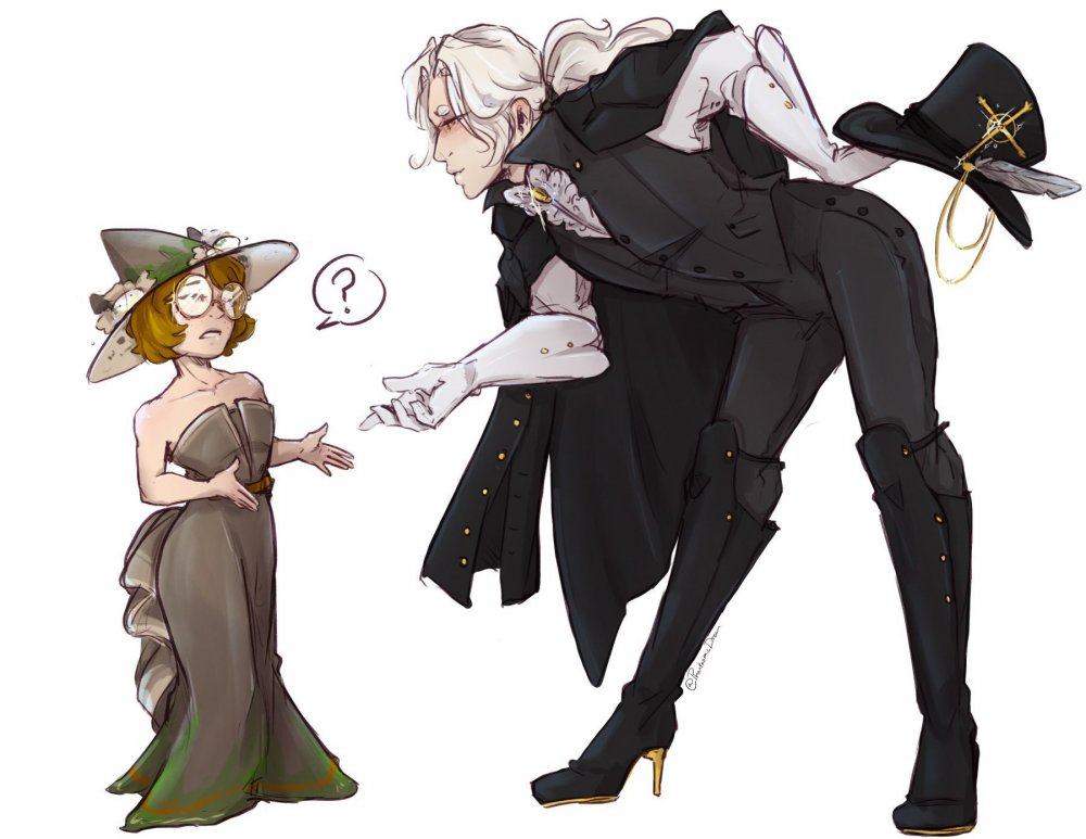
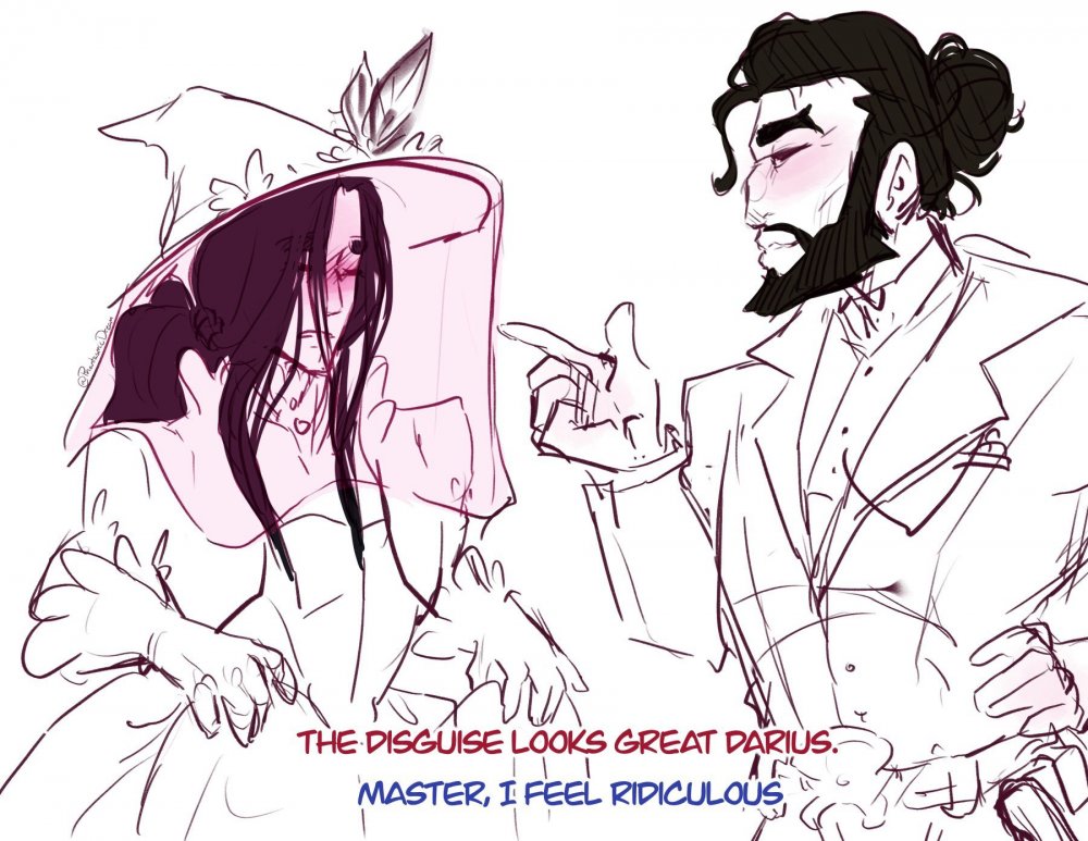
Sketches of two wizard from my Victorian Fantasy setting I started up a couple of years ago. Apprentice Darius White who is a lot better with magic than he claims to be. Master Darion Butler who has the habit of getting himself on people's badsides. Another sketch of my DnD character Auriel, with a scene from a session where he had to try and distract a guard... Trying to get the guard's attention a general knock turned into putting a dent in a metal wall... The DM mentioned about how have the group infiltrate a high-class party. So ofcourse had to draw some fancy outfits. Dunno what Auriel is expecting when approaching one of his party members, Holly (who's a Gnome Wizard)
-
He's eccentric. Plus it's only on his helmet. ^^'
-
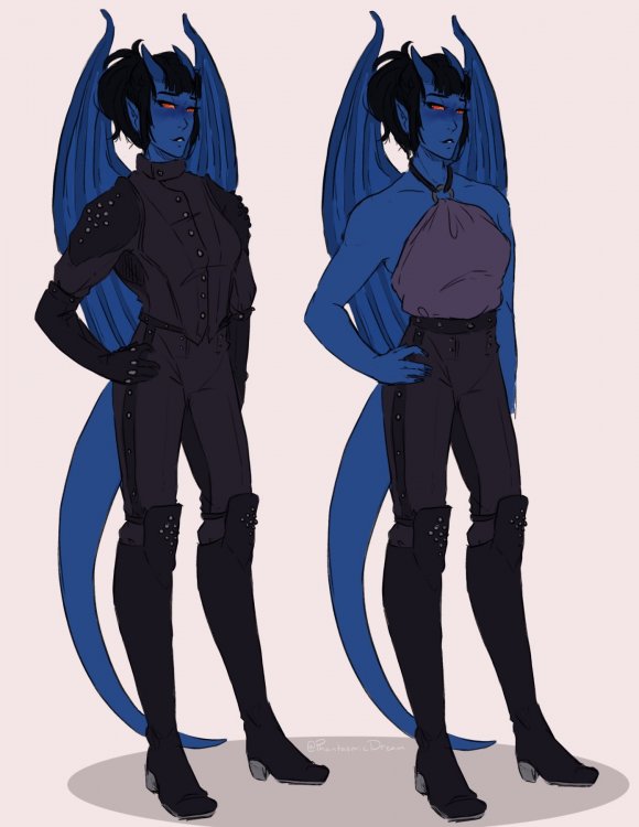
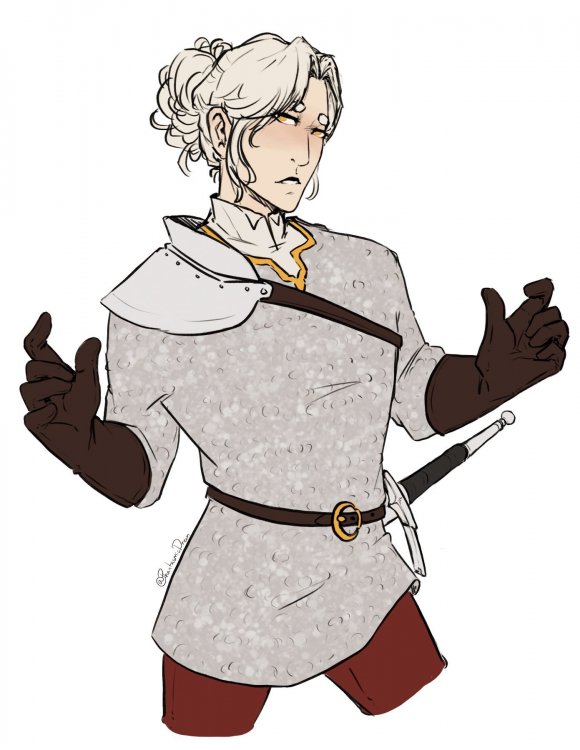
A sort of reference thing of my boyfriend's DnD character Arui Vilqirz she's a Tiefling trickster rogue Drawing Auriel, my Aasimar Paladin in the chainmail. Auriel and Arui rocking some new pants... A sketches scene from a session, where two Dwarf brothers went to interrogate the guard captain and making sure he gets drunk.
-
Here it is, Jonah and Zeke playing pool. UwU Also, I think we need to add pool tables ingame.
-
I'll have you know that I was watching both at around the same time.. (mind you I've already seen all the episodes of Merlin back in the day) Miraculous does have a lot of... Moments where characters forget how to be incharater or have any character growth that stuck. ;~;
-
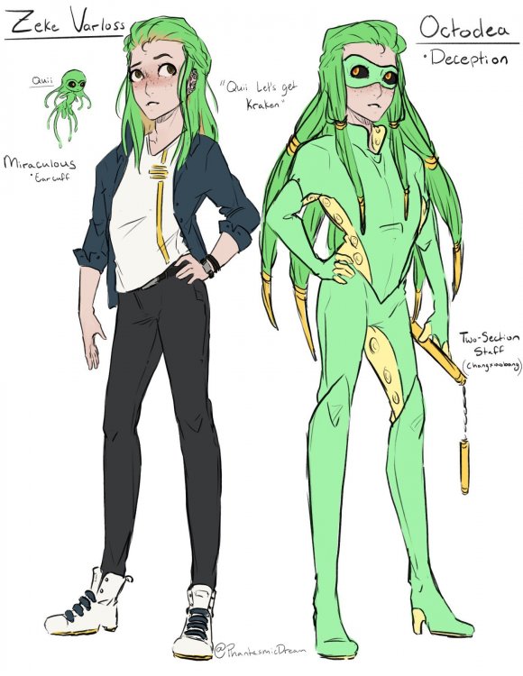
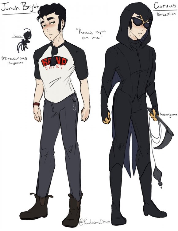
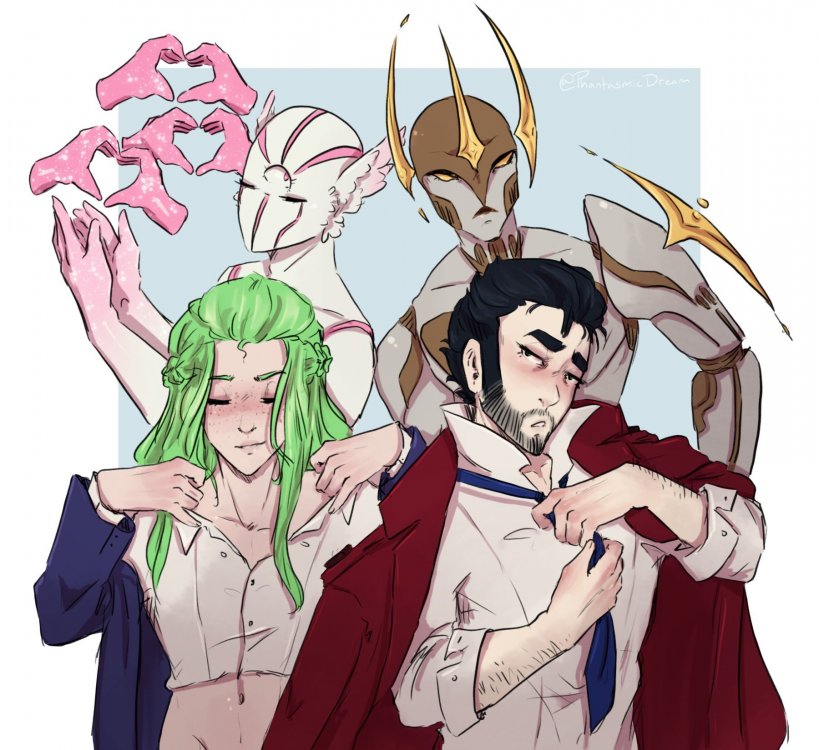
I'm just a simple girl who likes watching kids show. Watched all of Miraculous: Tales of Ladybug and Cat Noir and I'm like "Yas, I need to make a new AU" i don't have a problem, I swear! So, changing their ages so their just a year about and in highschool, because why not! their powers are still up for debate, though thinking Zeke could lay "traps" down and when activated they could make a sound/voice or an illusion of someone doing something. Good for luring people away. And think for Jonah that when his ability is activated his sense are abnormally enhanced, for a certain amount of time.
-
-

Reach the highest number without a MENTOR posting
PhantasmicDream replied to Trololiver112's topic in Civilian's Days
Five~ -
Composition Imagine if you will that your are a photographer trying to take the perfect picture. Composition goes hand in hand with "Backgrounds" because you are trying to create a visual appealing scene. Not all drawings have to go super intense on "positions" it could be as simple as making so instead of having the character straight on you could have them a little to the side. A sort of key factor to think about while trying to make a more visually appealing piece, is to avoid having your "focal point" straight in the middle of the picture. This where this may come in. Where one or both of these may look familiar. Rules of Thirds- Where you "grid out" the picture as such, and ideally have your "focal point" at one or more of that dots. But you'd want to avoid having your "focal point" in that middle square. This is probably the easiest and basic composition... where you just kind of have your main thing to the side. The Golden Ratio- Is a bit more complicating, sometimes getting a bit mathematical if you're wanting to get that in-depth with it. Pretty much you'd break down the piece to into a few different sections, till you have a small square which would be like a "focal point" while the swill will lead your eyes to it. Hopefully I'm getting all of this right. *sweats* Here we are again, with backgrounds. There's a bunch of different ways you can lay this out with your drawings using the "Background" "Midground" and "Foreground" formation. Where you can have items in the "Midground" to one side of the piece while items in the "Foreground" could be at the other side. Doing this would give the viewer two (or more) "focal points" to looks at instead of the one. However, there should be one that's more dominating than the other, because if you have both of them with the same sort of energy could make the piece more chaotic. (which is completely fine if that's what you're going for of course) Guiding the eye, would be similar to what the "Gold Ratio" may be going for. This is what you have your set "focal point" and you try to warp everything else in the piece to make sure if lures the viewers eyes to it. This could be like having the clouds angled towards the "focal point" or going as simple as adding "action lines" may depend on the type of drawing you're going for. While its not a bad this to do and it's completely fine if you're doing it on purpose. But it may be best of avoid making "Foreground" elements "frame" the picture. There's a time and place for "framing" pictures like that, and unfortunately they don't always help make the composition of the piece any better. Now, if yo're thinking. What are some other ways I can make my "focal point" more popping. Well a big helper would be colour choices and possibly lighting. It depends on what your "focal point" is. But you could always make it more brighter than the rest of the drawing. Or you could make it the complementary colour to your dominating colour to the piece. for example if the piece is mostly in purple then you colour make your "focal point" in yellow. Colour choices and composition can be a very powerful tool to use. Like some of the promo pictures to Steven Spielberg's movie Schindler's List Here's some examples of my own drawings, where drew a grid on the drawings and tried point out where the "focal points" are and if there's any thing that's tries to lure the eyes anywhere. Drawing one (Zeke and Slade) - Due to the angle of the drawing it could lure the eyes down to the bottom of the piece to where Zeke takes up most of the bottom. The way his body is curved may help lead to his face... but his one knee sticking out may catch the eye as well. RiP Slade (the mask version) is also a "focal point" being at the opposite end to Zeke. Drawing two (Comms Officer Jenkins and Nurn'Kal) - The "focal point" is up to debate with this one. But for the most part the drawing lures your eyes to more of the center of the piece (you know that area where they say you shouldn't have your focal point, we'll here we are going against that) You could argue that Jenkin's may be more of the "focal point" due to the contrasting int colours with Nurn'Kal. But I dunno, I'm thinking it's that's space between their faces. Drawing three (Zeke and Jonah, 80's AU) - With two sort of "focal points" going on here, the light from Jonah's flashlight and the glow from the tank Zeke is in. The flashlight is eye catching due to how "dark" the rest of the piece is. While Zeke and the tank he's in is eye catching due to having more colour than the rest of the piece. Drawing four (Zeke and Jonah) - The "focal point" in this piece is the glow that's happening in the background plus the heads. The sort of radius glow and the curve of Jonah's body try to help lure the eyes to the "focal point" In a way it's like things have come full circle... maybe.
-
Backgrounds. Who is she? Backgrounds can be a very tough thing to try and do and come up with, and if you're anything like me you just.... don't do them. Depending on the type of drawing you're doing you don't always need a huge elaborate background, and some times just a simple shape can be what you need. This can be great for just drawings of a character on their own or for a reference sheet. Something that's just a reference for the character design you'd want to avoid having a busy background. It could make it look too busy or unflattering. To really dive into full on scenes with backgrounds you'll probably have to dip your toes a bit into perspective the bane to most artists... I assume. Well, how do you approach doing perspective for backgrounds, you may be wondering to your self. Well, no other way the with grids... Send help One Point Perspective- Probably the easy one to do and to get a hold of. You can have that vanishing point anywhere along that horizon line. It's most commonly used for room like settings, or just any sort of "straight on" views. Two Point Perspective - Having two vanishing points that can be anywhere along the horizon line, depending on how close you put them together can warp the perspective a bit. It's probably most commonly used for "City Landscapes" but can be used for building interior as well. Three Point Perspective - Similar to the Two Point Perspective having two points that can be anywhere on the horizon line, it also has a third one that can be above or below the horizon line. Besides being literal hell to try and do. It's great for that dramatic scene. Now, what can make a scene more interesting with the background? Figuring out the different planes for the scene. Which would be to establish what is your "Background", "Midground", and "Foreground" There's a few different ways to approach this, you could have your "Background" being out of focused and then your "Mid" to "Foreground" be clear as day. You could have your "Background" being the whole back scene, then have characters in place of the "Midground" and "Foreground" When drawing up a background, you don't always have to go full on detail with it. Having too much detail, or attention to detail can make the whole piece look busy. This is when you'll have to figure out, what needs the details and what doesn't need the details. For an example, when drawing a forest scene, you don't need to draw everything single tree, you can draw the front ones more detailed then lessen it the further back the go. It's one of those things where you can just give enough information to the viewer and they should be able to fill the rest of the information in themselves, because the human brain is weird and does things like that. Now that we got some basic information on things what we can do for the background, how do we add characters to the scene? Well, with the horizon line... which may depend on where you put it, if it's too low you may have to slide in a different line somewhere more fitting? Pretty much the character's heads should line up with the horizon line (if they're shorter or taller than average than just have their heads hover around the line), but ofcourse for children and people sitting they're heads wont reach that that you'd have to base their measurements off of the people surrounding them. But, maybe after all that you're thinking, is there an easier way to do all this background stuff? Well sure, you could have take pictures of your surroundings, use 3D models (or the Sims) and take screen shots of that. Those could give you some possible quick? but I"m sure easy references. Here's a video by LavenderTowne, one of the "Tricks" she shows is using the Sims for designing/creating rooms. Tune in next time where I'll probably talk about "Composition"
-
Oh hey, it's some drawings of Jonah in suspenders. UwU
-
Clothes and Folds. Where you either add too much folding detail or not enough! When if comes to dealing with clothes, different materials and amounts will vary in result to have the folds will look. And what this boils down to is taking a look at clothes in real life, how do they rest on your own body? How to they rest on others? From there you can see a common pattern how folds tend to go. But for a very basic tip, where ever moving joint is expect that area to get the majority of the folds/bunches. Areas that are being tugged/pulled/pinched on will have more folds going on than the rest of the material. Unfortunately with clothes, you normally don't see all the details going on with the figure. Such as defined breast/pecks or muscles! Feeling like the outfits you draw a bit boring or plain looking? Add a bit extra details to your clothing, add seam lines. They can vary on some outfits, being a long the sides of shirts or pants, around the neck hole (or collar). Adding patterns, look at your own wardrobe, or search up "fashion" clothing online. Go 1920s on dress pants and add in that ironed crease! You know, just really try and play around with fashion, it can be weird and bizarre at times, anything can go! The different ways that the body can move will change the ways the clothes rests and folds up. This means that you'll have to start thinking up your figure drawing more of a "3D" space than just being "2D". So, start thinking about those wobble arms being more cylinder!! If it helps you could start doing a few curved lines around parts of the body, and depends on the pose you may even notice that these curved lines can change the way they're going while being on the same limb. Figuring this kind of stuff out does get easier the more you do it. Or just make it up as you go like I did for years.
-
Here's some sketch books... sketches. This is continuing on with my "JoJo AU" because I dunno, I'm obsessed? Lol But this time I'll be introducing two villains. First we have Nectarios Van Halen (who is just a "human" version of my IPC NECROMANCER), this character is just a Vampire and I'm still coming up with ideas for his Vampric abilities!! Second we have the enemy stand user Alex Rockwall and his stand Dreamweaver who can raise the dead and possible make undead? Still working out a lot of the details. Someday I'll make up a nice finished piece for this AU!! I'm also now wondering if I should try fitting character into other sorts of media for fun? Because so far I have my Star Wars AU and now the JoJo AU .... Not counting the other AUs.


.thumb.jpg.f05ab989e04ec6dd70c8f58f1c3b3d03.jpg)
