Puckaboo2
Members-
Posts
21 -
Joined
-
Last visited
Puckaboo2's Achievements

Grey Tider (1/37)
5
Reputation
-
Give us an option to draw or inject 1, 5, 10, or 15 units from a syringe, please? It works for droppers.
-
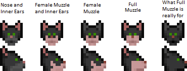
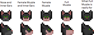
I have some markings I would like everyone to see. The first one can be a head marking and head accessory, called "Inner Ears and Nose". It combines, well... The nose and inner ear sprites, so you don't have to waste room for more accessories. The second and third are head accessories. They're a muzzle markings to make a male and female Tajara monocolor by setting the marking the same RGB as the coat you've chosen. They're named, "Monocolor Male Muzzle" and "Female Monocolor Muzzle". Male is on the left and female is on the right in the following picture: The female muzzle from east and west is a work in progress. Because it has no outline on the bottom of the head like the male does, I cannot figure out how to outline the muzzle area without contrasting too differently from the original design. I'm not too fond of the male muzzle to the side, either, so any ideas and artwork are appreciated! The last marking is a body accessory. It's named, "Monocolor Tajaran Belly" and it serves the same purpose as the monocolor muzzles. Here is a male Tajaran with the monocolor male head marking with the body marking. (no tail, sorry. Forgot to add it.) If you all have any suggestions or questions, shoot away!
-
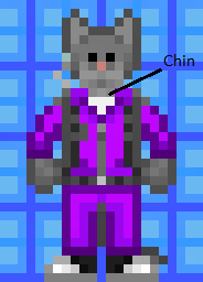
After overwhelming amounts of displeasure from people. I have decided to revert some of the changes I have made in favor of Shadeykin's suggestions. The new muzzle extended beyond only three masks, which I have edited. No helmets were affected. The muzzle fits on top of the body. Body markings have not been modified The male muzzle and muzzle w/ inner ears has also been modified with a chin. Don't worry. Here is what they look like in game:
-
I'm sorry, but I'm not changing anything, except that pixel on the side of the body. I am not making the border of the belly shading any darker than I made it. The border does not and never has or will represent the arm; it represents the belly, so it should be a lighter shade than the rest of the body. The way Taj look from the south is fine, and you are nitpicking issues which were present BEFORE I made my fixes, and you only brought them back. You are the only one complaining about the chest and the chin, even after I elaborated on why I chose to do what I have done. My model DOES have a chin, right below the head. It is part of the torso, but it isn't intrusive or clips into anything. It is light in color because it completes and rounds out the muzzle, below the face, instead of coming to a square stop. The way you made it completely separates the head from the rest of the body and gives the Tajara a permanent sad expression. Why would the chin not be the same color as the muzzle? It makes no sense.The original Tajara design was not like any of your suggestions--look at the head reference on The beige Tajara--the original. The original translation was lost due to poor spriting, so I restored the designs that were lost and improved upon them. All I did was make the border of the belly a bit lighter from east/west to make it appear more fluffy. The opposing arm isn't supposed to show, but the hand is. The glove and the hand only have a 1x3 dimension, so the hand does not need to go into the belly, anyway. Aside from maybe making the female's torso on the north/south the same as the male's, the models are a upgrade, and 90% of the community thinks so, as well. I don't like your changes, to be honest, because they take away the focus of the most important aspects of what make a Tajara, a Tajara: large ears, large muzzle, light belly. I don't want to make any more changes, again, aside from the female's waist.
-
Considering the belly, all I did, from east and west, was lighten the border near the belly. Additionally, the belly markings extending to the neck when the Tajara faces south is an extension of the chin, which is which you wanted to remove. No, that does not clip into any armor or clothing. Without those lines of pixels, they give the face a squarish appearance and leave the face feeling something to be desired. See? The muzzle just stops. It feels unfinished. About the ears, I have no intentions of shading them because most Tajara you see running around the station sport over a dozen styles of manes, Tajara can wear, all of which usually blended into the ears unless the mane is really dark. The way you shaded the ears makes the ears actually appear to make them shaded and facing inward, rather than them facing away from the skull. Which is why I rather leave the ears unshaded so they appear to be facing forward. Edit: I realized the fix for the tail gap between the female's legs causes the tail to clip into the groin of clothing. I may have to add an extra black pixel on the female's groin (You won't notice it unless both legs fly off) just to compensate for the dot.
-
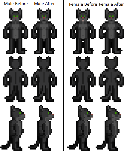
If you want 64x64 view, open the image up in Microsoft Paint and size 200% (not resize, just the scroller.) Males on left, females on right.
-
I'll post some tomorrow.
-
I do. I have Unathi and Grey planned, right now.
-
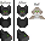
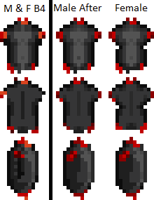
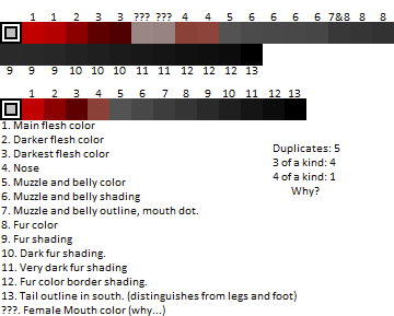
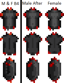
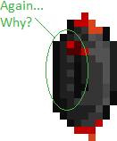
Straw poll for people who cannot vote. Oh, boy, where do I begin with all the problems I see, here? There is a GAP between the female's legs where the tail should be, for one! Feet shouldn't be shaded when they are only one pixel wide. The ears are darker than the head. The tail is darker than the rest of the body. I have so much to cover for these little guys, and it's saddening. Let's start with the colors. I do not even need to explain how unprofessional the amount of near-duplicate colors I see on the original sprites. This is screenshotted from the actual sprite palette from Dream Maker. There are exactly five duplicate colors, four 3-of-a-kind colors, and one 4-of-a-kind colors. The top palette represents the colors of the current Tajara and the bottom represents the current updated ones I have. Zoom in on the tail. For some reason, 9 acts as the shading for the tail from the north direction, while 11 and 12 act as shading for the tail in the east and west position. I've decided to match the tails' colors to whatever part they connect to and color the border as the same color as the body. Now that I have addressed the color issues,, pull all images I show you in in Microsoft Paint and zoom in as I explain what I have fixed. The reason why I asked you this is because some of the changes are very subtle. Let's start with the heads. I'll target problem areas in bold and explain them. This is the male's head. Ears: The border shading of the ears do not match the rest of the border shading of the body. The ears, from the north position, are more dark than the rest of the fur, which does not make any sense as they were not like that in the original Tajara design. I re-shaded the ears and the back of the head to match the rest of the body. Muzzle: On the front, it has lost its shading. To fix this, I went to the original sprites for a reference and I matched the shading to it. The 'chin' on the reference Tajara is part of the torso's body patch, so it doesn't clip onto clothes. On the sides, there is a dark pixel on the cheek that has no purpose. In fact, it looks like a side mouth. I've removed it, and also an outline pixel to the left of the dark pixel (the mouth on the muzzle) Now, let's look at the female's head. I'm not going to say anything about the ears because they are the same as the male's. Female Muzzle First, the shading on the side of the face from the south position is inverted. The female's mouth has a pink dot and this is an issue because when people make female Tajara with lighter colors, that pink dot ends up looking like a tooth and the end result is a buck-tooth hamster Tajaran. Credit to SideCat for my daily dose of lols for the hamster comment. The female muzzle from the side not only has unsightly speckles of dark fur, but the color of the muzzle marking flare does not match the color of the belly patch (Don't believe me? Look at the full body on the first image,) nor does it have the shading the male has. I shaded the muzzle flare with an outline so it is still obvious the marking is different than the male's, but it does not reduce the surface area of the muzzle. Let's look at the bodies, now. The reason why the flesh is darker than the original is because the flesh color does not stay the same when people have lighter Tajara. For example, my pure-white speshul snowflek has pure-white fur and her resulting flesh is a light pink. Now, someone please tell me why the female looks exactly the same as the male? I'm not joking; there is no pattern difference or body shape difference from male to female. To fix this, I've used the human models as references and gave the females some hips from the north and south state. I have honestly attempted to give females a different body patch than the males, but they ended up looking they had a giant dick plastered on their chests no matter what I did. I can try again, if you want, though. What I COULD do, however, was give the upper chest, below the neck, a little bit more shading so the muzzle would connect with the patching on the chest, but not too much. I also gave the kitties some shoulder blades and armpits like humans have. But, the sides... Ahh, the infamous dangling arm when the thing should have been amputated. I removed it, as you can see. I think I am pretty much done explaining the flaws of Tajara. In other news, I have added some markings to Tajara. No, we had none of those markings before. And YES, YOU CAN HAVE A MONO-COLOR TAJARA. Angora kitties unite! Well, that's it! If all goes well, next, Unathi!
-
I am in the process of editing the final changes to the sprites before I post them on Github.
-
The problem is, I don't know. All they said was that my models were inferior. They wouldn't tell me what about or why, other than 'a professional said they were inferior,' which I find very rude as someone who has made small rpg sprites and shaded for almost ten years. Removing the belly pooch will leave a gap between the stomach and where the little sliver of the hand that partially hides behind it. That said, I do not wish to modify the overall shape of the model...for reasons I've already stated. I'm thinking about putting the changes on GitHub, but I am not sure, yet.
-
I understand exactly where you are coming from; the overall shape of the back and the waist is honestly exactly what my old sprite looked like--before the maintainers rejected it...which why I kept the body shape similar to the original, even though I feel the modifications looked better. My goal is trying to not dramatically change the overall shape of the sprite, which is what the maintainers pretty much rejected all of my sprites for. Although I do agree your changes are more anatomically correct, I can't risk making the changes you suggested in fear of rejection.
-
I don't know if I can do anything about that. I think you're used to seeing the outline of the arm on the bare torso of the female, which is why the side looks featureless, now. It honestly does look barren, now that I think about it, but I honestly don't know what else to do.
-
I could make the pecs look a bit lighter or add a very subtle 6 pack with it. How does this look?
-
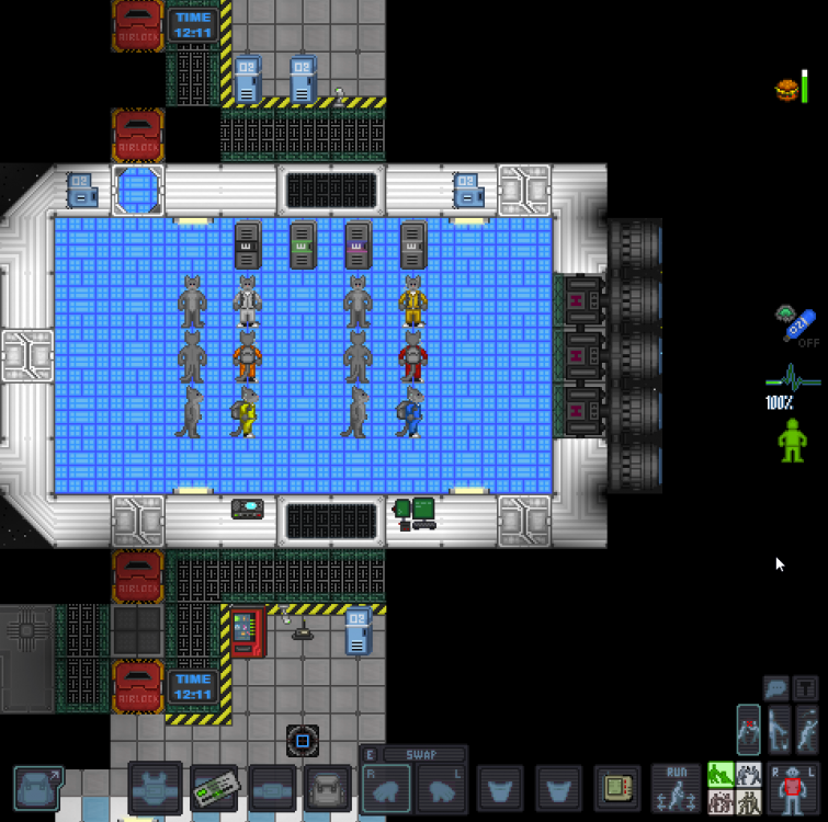
Yes. Nothing pokes out. No part of the body, whether fat or skinny, had any of their pixels widened or modified to where they will not fit in uniforms. I am extremely anal about positioning and layers. XD
