-
Posts
596 -
Joined
-
Last visited
-
Days Won
3
Everything posted by Nomzy
-
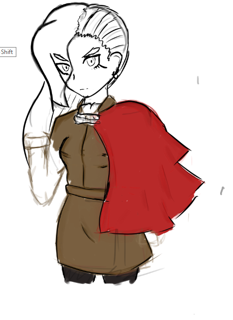
Noticed a lot of similarities between Dave/Nera, so I used one of his poses and similar costume. Hooray.
-
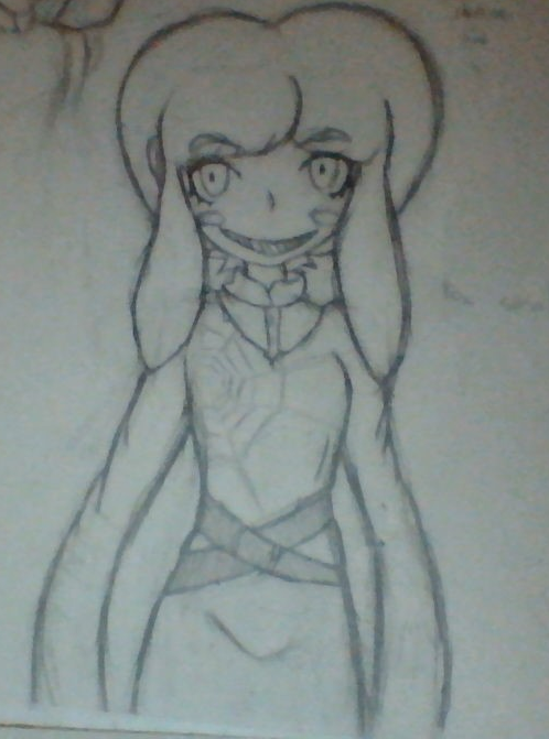
Friend noted some similarities between Orphea (New HoTS person) and my Nera, so I decided to draw her in the costume. Novakid character I've been playing in Starbound through Frackin' Universe. Real shitty camera hours.
-
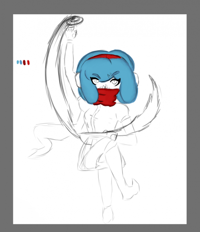
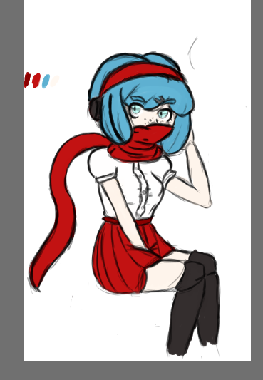
It's been awhile since I posted here! Not that I've progressed much since then. I have a few things I want to post. Chronologically, here we go. Two of Nera. My new sketchbook can't take much of a beating, so the second one is kind of fucked up. My fault. And the mechanical pencil, I swear. One of a pokemon trainer design I made up. She bundles up in things with lots of fur underneath, usually. Gotta get toasty. Meenah from mostly memory, so her hair isn't true to the original. Yeah, Homestuck. I get it. Oof. But she's cool. Haven't been able to draw much. Lack of ideas, I suppose, don't feel like drawing my characters as often because of some things. So for now I'll probably draw more Homestuck characters to get back into the groove. Maybe soooon.
-
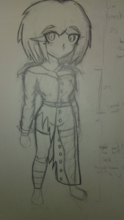
So it turns out that all summer long I just decided to have an art block instead! So here, have another Dia. This is a placeholder redesign for the timeskip we went through but it's there, nonetheless. And also a few notes on the side when I reviewed the drawing.
-
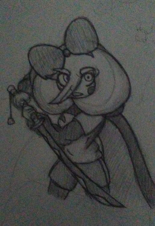
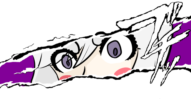
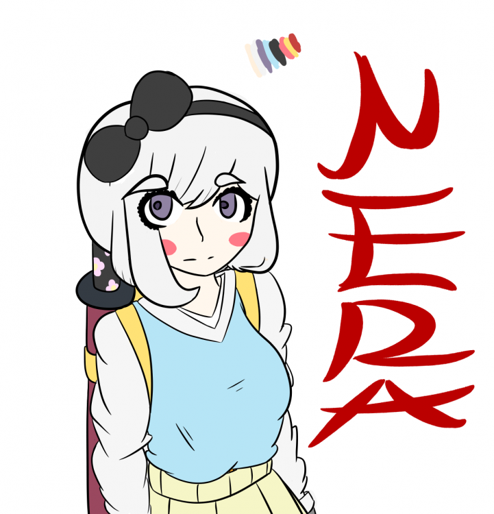
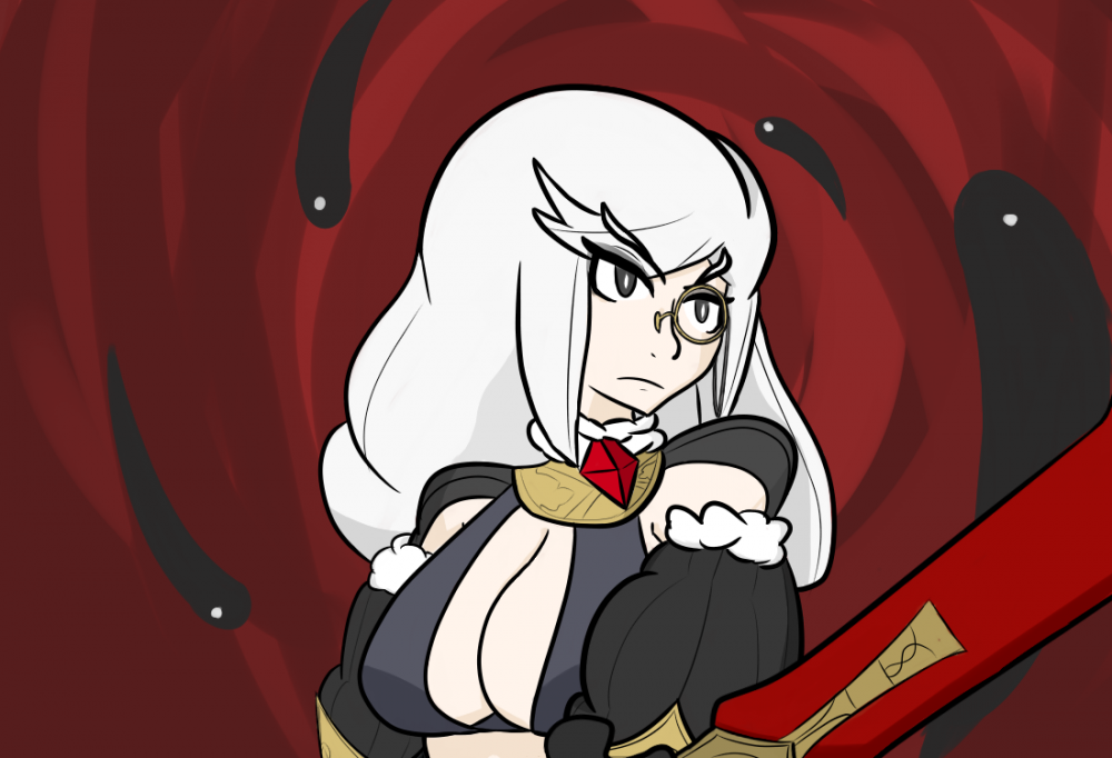
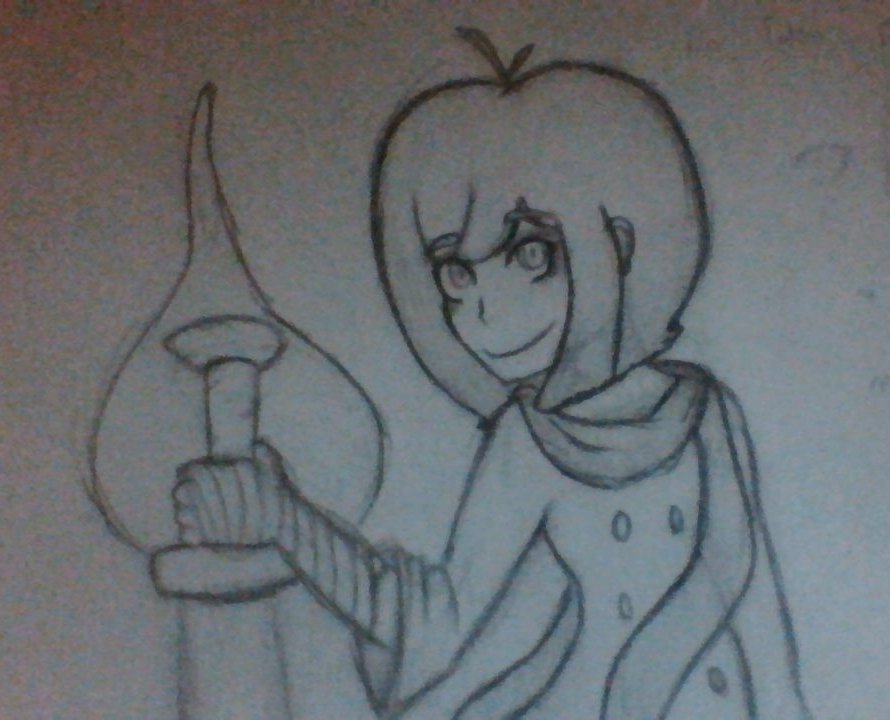
Made some stuff for my sword girl nera. she's pretty cool. and a little persona cut in thingy cause i wanted to use the template for something actually decent
-
-
Told you it was the last one. Im really enjoying this drawing, but my handwriting is less than desired, to say the least. When I figure out how to merge the layers text creates in firealpaca, I'll be sure to update this image though.
-
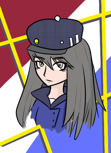
Last fucking bust I swear they're not even anatomically correct, someone stop me I need to change the colors and some aspects of the design around, too similar to a certain detective, but otherwise im happy with it.
-
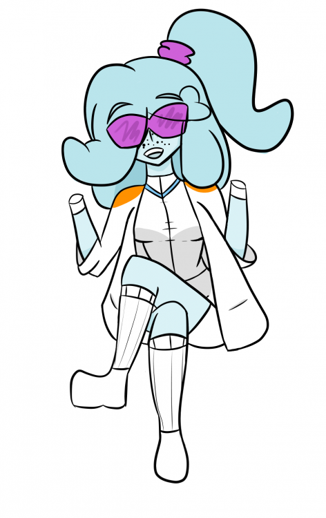
Been some time since I updated this topic. Here's a chemist sue pic in which I tried to get hands to work but lack of foresight made it really hard to get any good looking ones in, so I said eh! Figured I spent enough time on the drawing so I just left feet/hands as is. Tried to get more shading in though.
-
Decided to practice some level of shading along with not using black for lineart. I think it turned out fairly well!
-
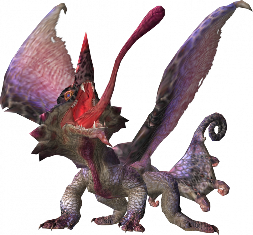
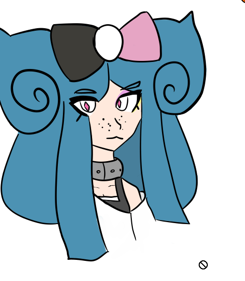
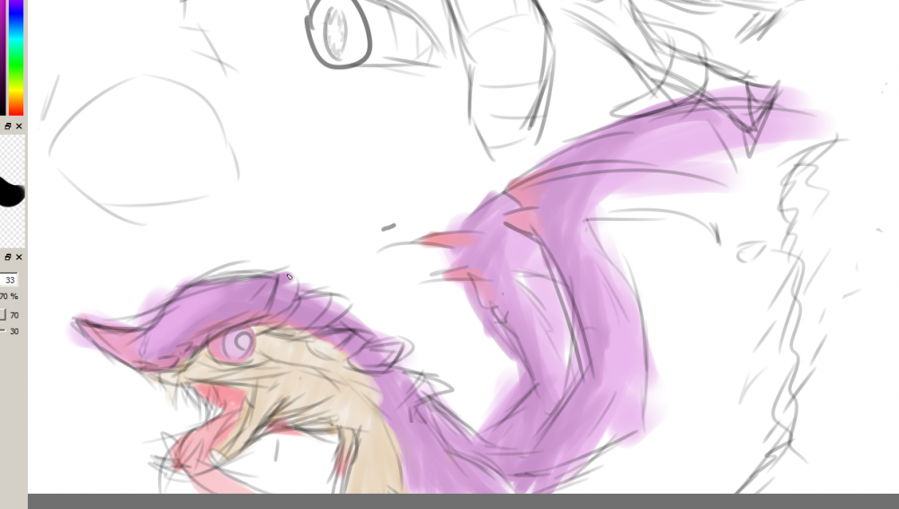
Better. It's my boy Chameleos (very large image, in hindsight) I also really appreciate the comments on the art style! Not many people really comment on how it looks, so I never knew the sort of 'impression' it gave people. I don't like posting without dropping a drawing, so here's the character im using in lieu of the one with the scarf earlier. It's also my best working with digital art so far, even if the original was on paper! holy shit a lot of my chars have freckles reallyneedtogettoworkonhowtoactuallyusecolors also her body is really tiny
-
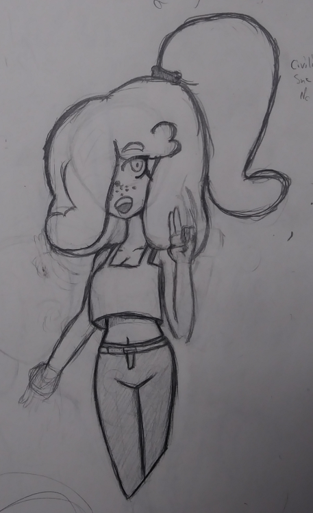
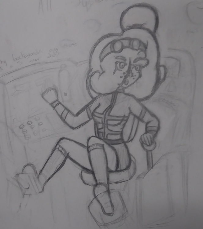
Hello! This probably will be my last post with decent quality images for a bit! Or any, my laptop is getting repaired, so yeah. This time I did some redraws of Sue, my character. Lots of improvement since the last two pictures I showed. Missing hands edition! Here's civi sue without a costume. Here's a roboticist Sue in a mech. Pardon the shitty surroundings, they were a last second afterthought when they PROBABLY shouldn't have been.and ramblings, it seems I can't stop talking even when I'm not talking. I feel like her hair goes through a redesign every time i draw her but whatever.
-
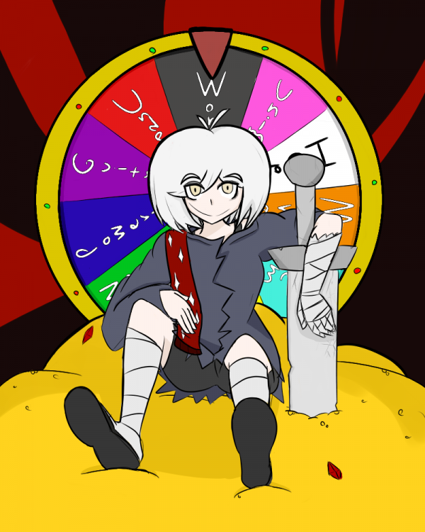
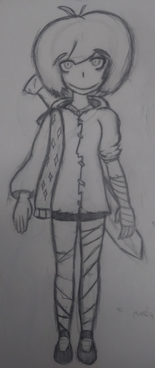
Thanks a lot! It was intended to be pretty friendly, but eerie. On that same topic (and i need to chill with drawing this char butohwell) here's another. I wanted to lay out a full design for reference in other pictures. The differences between the two hands are pretty jarring BUT HEY I'LL GET AROUND TO IT Otherwise, I wanted to get a really roughed up feel with the clothes and bandages, thus gave her a worn coat and a bunch of bandages, some of which are just plainly for aesthetic. The scarf is only there really for an attempt at balancing both sides. Hopefully, the friendly smile in all this turned out to be a little more unsettling because of everything else being all messed up.
-
hey. my girl Dia Kiribi this time--I posted a redesign earlier and decided to go further with it. Camera quality is slightly less bad. I wish I made the body bigger and didnt angle it so badly, but all in all I don't think its that bad.
-
I know what you mean--most of my digital art seems to come across a lot softer than in my sketchbook. Glad you like it. Bad camera time! This is a recreation/redesign of a character I drew not too long ago. Doesn't look as much as a little shit, and looks more creepy--I want to do more drawings with this design more. This is a W.I.P of the character I've been drawing more lately. There's a few oddities in the picture i intend to fix later, but this is mostly just more practice with coloring stuff!
-
Got another character coming up, again, for a campaign if I join it. A quiet character obsessed with technology.
-
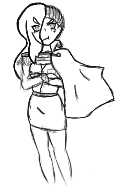
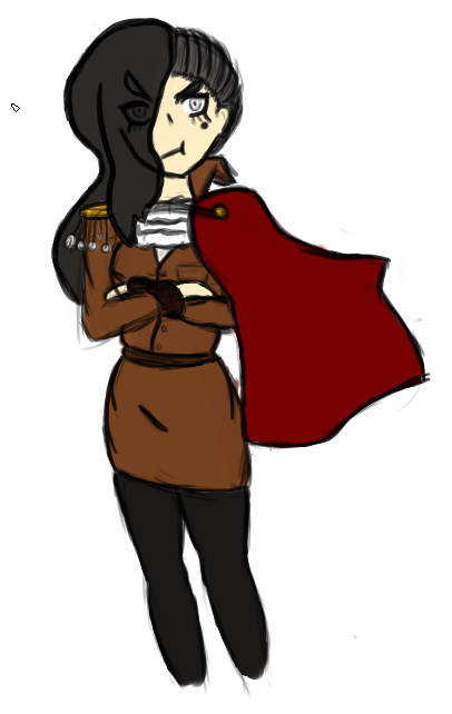
Hey, thanks for the encouragement! Really appreciate it. Recently I drew something in my sketchbook which I really liked, so I decided to trace it digitally. I post two versions again this time mostly because I mostly prefer the sketch, since again, I'm not very good with colors yet. But hey--same character as before, but with a slightly different design.
-
Been spending way too much time on this then I should have--decided I needed to brave my fears and actually do SOMETHING with the pen tool so I went ahead and outlined this, as shitty as the outline is, its a start. Also unfinished. Heres the work in pencil vs color and some pen. Looking back, the progress versus the first image and this one makes me feel tingly, but I still got a ways to go.
-
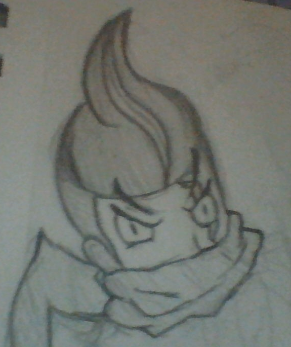
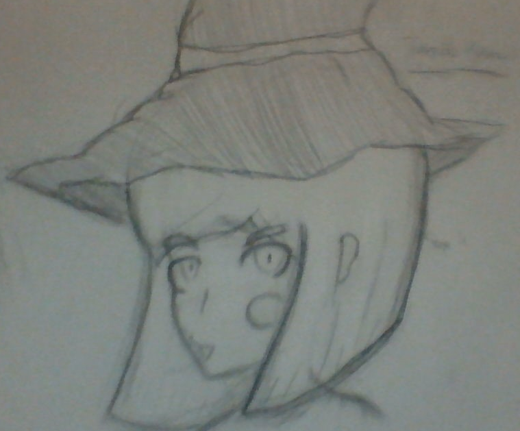
woo here are some toootally long awaited doodles i decided to upload First off is a small Gundham, from DR2. Wish I drew this with his body in mind but ohwell. I think it turn ed out decent regardless, considering how bad I usually am with short hair and those kinds of eyes. Next is a...special Himiko, from DRV3. The right side of her face kind of got screwed up harder as I went, she wasn't always like this ok. It's mostly just me not spacing out her left eye correctly/placing it somewhere better so as a result anything on her right side probably would've ended up looking just as weird. This one is quite different--I have barely worked with color at all when drawing so being able to access it with a drawing tablet was a blessing. So I decided to mess around with my favorite monster and the watercolor tool in firealpaca. I think it turned out mostly decent--bar the skin color, since I was having a hard time finding that particular color. that's basically all I have for now. sorry for the shitty camera quality on the first two. i'll prolly be posting more shit here for those few that check back on this topic, especially since I got my tablet and im seeing ez improvement.
-
-
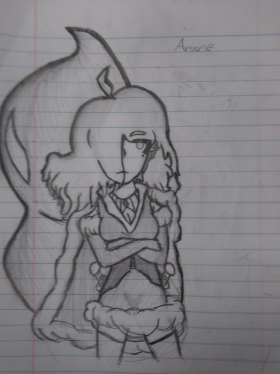
Decided to draw a character I'm playing in a pathfinder game. Meet my shadow-walker rogue, Arsene. Still working on trying to get my characters to be less flat, for a better word. When I have peace and quiet, probably will try to see if there's any resource for that.
-
Got the game. Love dancing around enemies with IG in this game, and I haven't really tried something else. Re-positioning with DB seems like a good QoL and it really seems they brought everything in line in this game compared to GS, now that I can see the damage numbers. I also might pick up a ranged now that the system isn't clunky as hell. My PSN should be Nomzoogles, if anyone wants to add me.
-
Yo. Long-time Monster Hunter player here. Usually go greatsword, IG or DB in these games. I'll be picking up MHW soon so you'll probably see me active in this thread as time passes.
-
Is your art inspired by anything? It feels oddly familiar to me. Also, the progression in sketch stages for the vampire face is hilarious.
